Illustrated covers for a series of classics
- Year
- 2025
- Client
- Wordsworth editions
- Agent
- Folio Art
Illustrated covers for a series of classics
- Year
- 2025
- Client
- Wordsworth editions
- Agent
- Folio Art
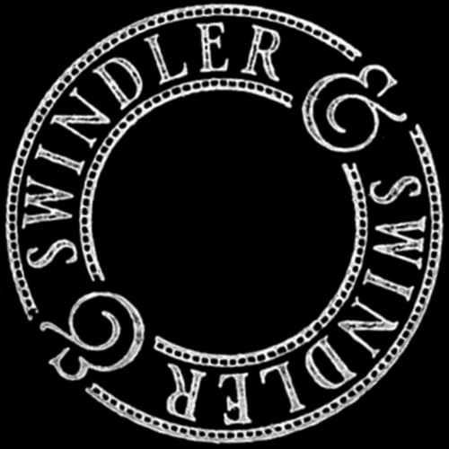
A series of nine covers for literary classics in Wordsworth Editions' Luxe Edition range, commissioned via Folio Art. Gold foil on cloth binding, full format, and an interpretation specific to each title.
A distinct range within Wordsworth
Wordsworth Editions is a British publisher founded in 1987, based in Hertfordshire. The house built its reputation on a catalogue of accessible classics — the £1 Classic launched in 1992 remains its founding gesture, and the catalogue now holds around 500 titles.
The Luxe Edition range occupies the other side of that editorial policy: limited edition, cloth binding, embossed gold foil, coloured edges, patterned endpapers, ribbon marker. The commission to Swindler & Swindler falls within this range — nine classics relaunched as a series, with the cover illustration becoming the visual signature of the collection.
Nine titles, full format
The commission covered nine titles — Alice in Wonderland, A Christmas Carol, The Secret Garden, Jane Eyre, Anne of Green Gables, Little Women, Pride and Prejudice, Wuthering Heights and The Great Gatsby — a selection decided by the editor, with no detailed art direction brief. The illustration covers the entire binding: front, back, spine, fore-edge, and a repeat pattern on the endpapers, derived from the cover botany.
A two-step method
The process built itself intuitively. Rémy set the typography first on each cover — a system shared across the whole series. Margot stepped in next, building the illustration around that fixed base.
That sequence became the method. The rigidity of the typographic skeleton freed the drawing: the balance between title and illustration no longer had to be negotiated, it was already resolved. Margot could compose each illustration freely, knowing exactly what space was left to her.
Drawing for foil stamping
Gold foil stamping on cloth binding demands fully vectorised, constrained files. No heavy fills, no dense areas that would hold the heat of the stamp. Lines need to stay thick enough to hold on textile, but open enough for the motif to breathe under the foil.
That constraint shaped the drawing itself. The work moved through three tools: Procreate for sketch and finalisation, Photoshop for preparation, Illustrator for vectorisation. A line meant for vectorisation and then for foil stamping is not drawn the way a charcoal stroke would be. The restraint of the line is technical before it is aesthetic — the aesthetic followed naturally.
An interpretation specific to each book
Two pillars hold the coherence of the series: a shared typographic system, and a compositional structure identical from title to title. The rest is fixed. What varies is the illustrated subject.
Each cover carries a sign chosen in echo to the world of the text. For most titles, it is botanical — flowers and foliage answering the matter of the story, its period, its seasons. For others, it is an object, a scene, a motif belonging directly to the narrative: a deck of cards and a teapot for Alice in Wonderland, bells for A Christmas Carol, birds for The Secret Garden, fireworks for The Great Gatsby. It is the only creative variable across the nine titles, and it is the one that carries the reading into the object. The endpaper pattern, specific to each book, extends the same logic inside the binding.
The project played out within those constraints: open art direction on one side, locked output format on the other — vector, foil, series coherence. That tension structured the work more than a detailed brief could have. The choice of subject is the quietest decision, and the one most directly tied to what the book tells.
